


BRIEF
Designing for transitions. In this university studio project, we explored the transition into motherhood, highlighting the importance of a centralised and continuous maternal support system; one that helps new mothers to overcome mental and physical challenges.
DURATION
13 Weeks (Aug - Nov)
TEAM
Myself + 4 Team Members
METHODS + TOOLS
problem
During a pivotal time of identity and lifestyle shifts, many mothers feel neglected as their needs and wellbeing become secondary to their baby's.
Whilst a mother's ecosystem provides a level of support, they aren't interlinked or are hard to access, therefore creating gaps in the holistic care that mothers need to overcome maternal challenges.
THE ECOSYSTEM
Current apps and services are primarily focused on baby care; overshadowing the needs of mothers. This further highlights the limited easy-accessible maternal support available.
PRECEDENTS
research
PRIMARY RESEARCH


ANALYSIS + SYNTHESIS
We utilised thematic analysis (affinity diagramming) to validate identified patterns across all data sources and articulate clear insights to define the problem:

Through this, we generated five key insights:
1
2
3
4
5
REFINED PROBLEM
ideate
IDEATION PROCESS
1

2

3

4

TAKING A STEP BACK…
As Insight 4 revealed, the wellbeing of mothers also depend on the active role of partners and families. And so we also explored and ideated on the POVs of partners, considering their experiences and the level of maternal support they are called to provide.
As mentioned earlier, parts of a mother's ecosystem are often not interlinked or hard to access. Thus, we were set on designing a centralised experience that both provides practical support for mothers and encourages the proactiveness of partners and communities.
prototype
OUR PROCESS
USER TESTING
EXPERT TESTING
LOW-FIDELITY TO MID-FIDELITY
Out the app's information architecture and user flows weren't perfect, but provided us with a good overview of how we could integrate each of our ideated concepts into one experience. It was crucial that we made sure each screen had intention; an insight to back it.


Conventionality from existing apps such as Facebook, Instagram and Reddit.
Consistency of visual and functional elements.
Familiarity improves learnability, and reduces cognitive load.
Streamlined onboarding and navigation with limited touch points.
Increases efficiency and overall usability.
USER TESTING
PRE-TEST SURVEY
THINK-ALOUD
SEQ SCORING
POST-TEST SURVEY
POST-TEST INTERVIEW

We also provided participants with context and referencing using printed scenario cards and task cards, improving the efficiency of the testing process.
HIGH-FIDELITY
After consolidating our feedback from user testing into actionable iterations, we worked on the high-fidelity prototype, focusing on usability, interactions and visuals. The following are iterations we made with design principles to back them:
1

-> Colours, improved information architecture and overall improved visual design made affordances more obvious.
2

Our prototype's booking form was a major cause of confusion due to the ambiguity of selected and available dates.
-> This was simplified by reducing down to only the available dates in a carousel form.
3

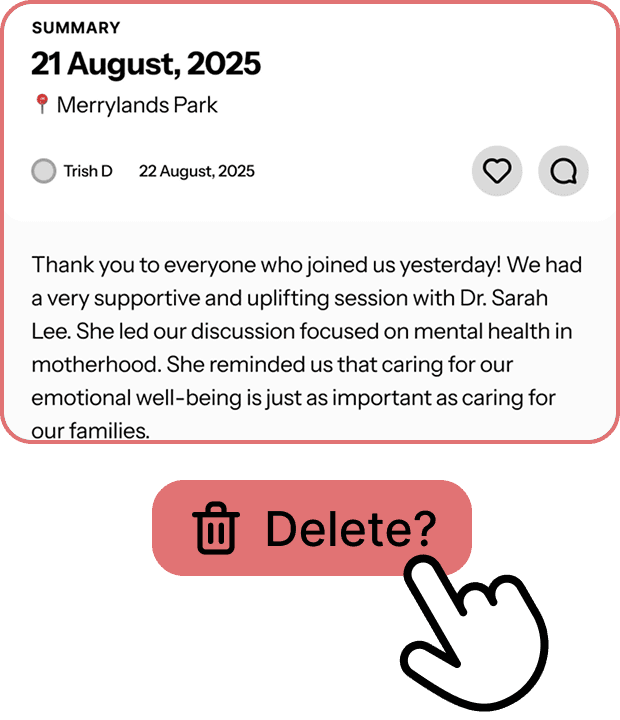
-> Say bye bye to the Meet-up Summaries!
It was discovered in user testing that mothers do not need this, as it would feel like "work" to catch up on meetups.
EXPERT TESTING + FINAL ITERATIONS
Our experts tested both user flows against a criteria of Norman's Usability Heuristics, of which we applied a severity rating to indicate changes we should make.
CRITERIA EXAMPLE
The following are examples of final iterations:
1

-> Onboarding wizard that reduces down information to bite-sized steps aimed to improve learnability for new users.
-> User control and error prevention with the back and skip buttons.
2
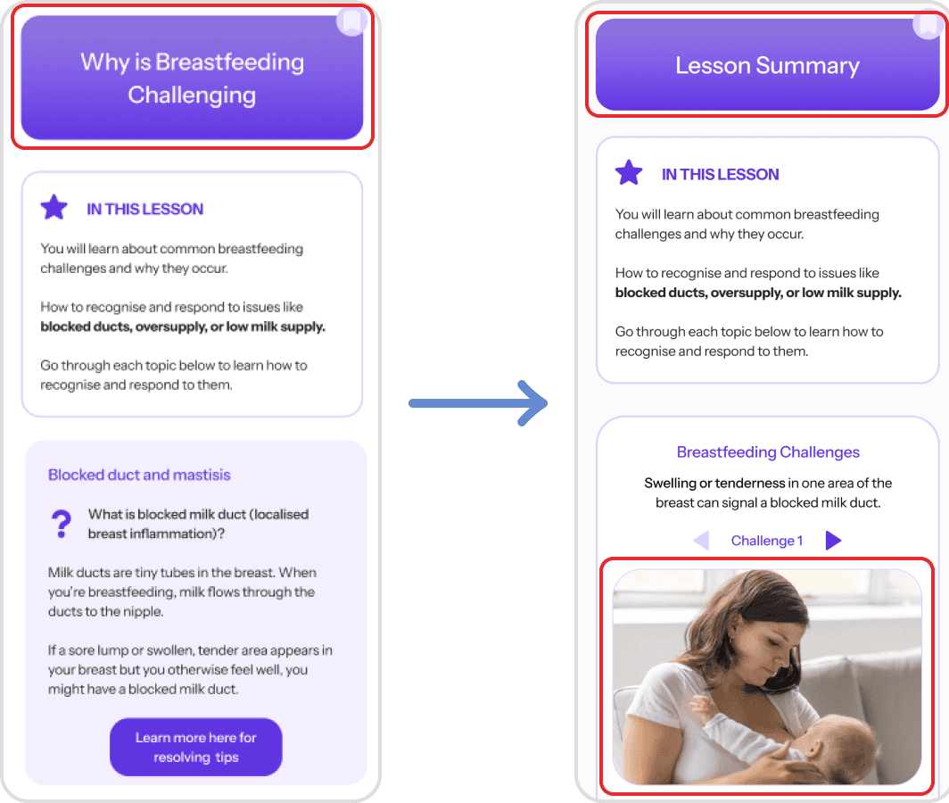
Experts found the initial page titles confusing due to a mismatch with content.
-> We changed the titles so they better aligned with content and that users are more informed of what to expect.
-> Simplified content, added more visuals and took advantage of intuitive elements such as carousels.
3

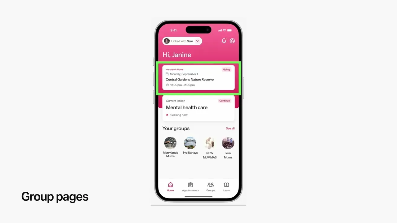
-> To maintain the cohesiveness of our app’s UI, we adjusted the meet-up cards so that they were consistent with the card on the homepage.
-> Notice how the information architecture is a lot better here! We used more varied text colours to draw attention to whats more important - the location.
final product
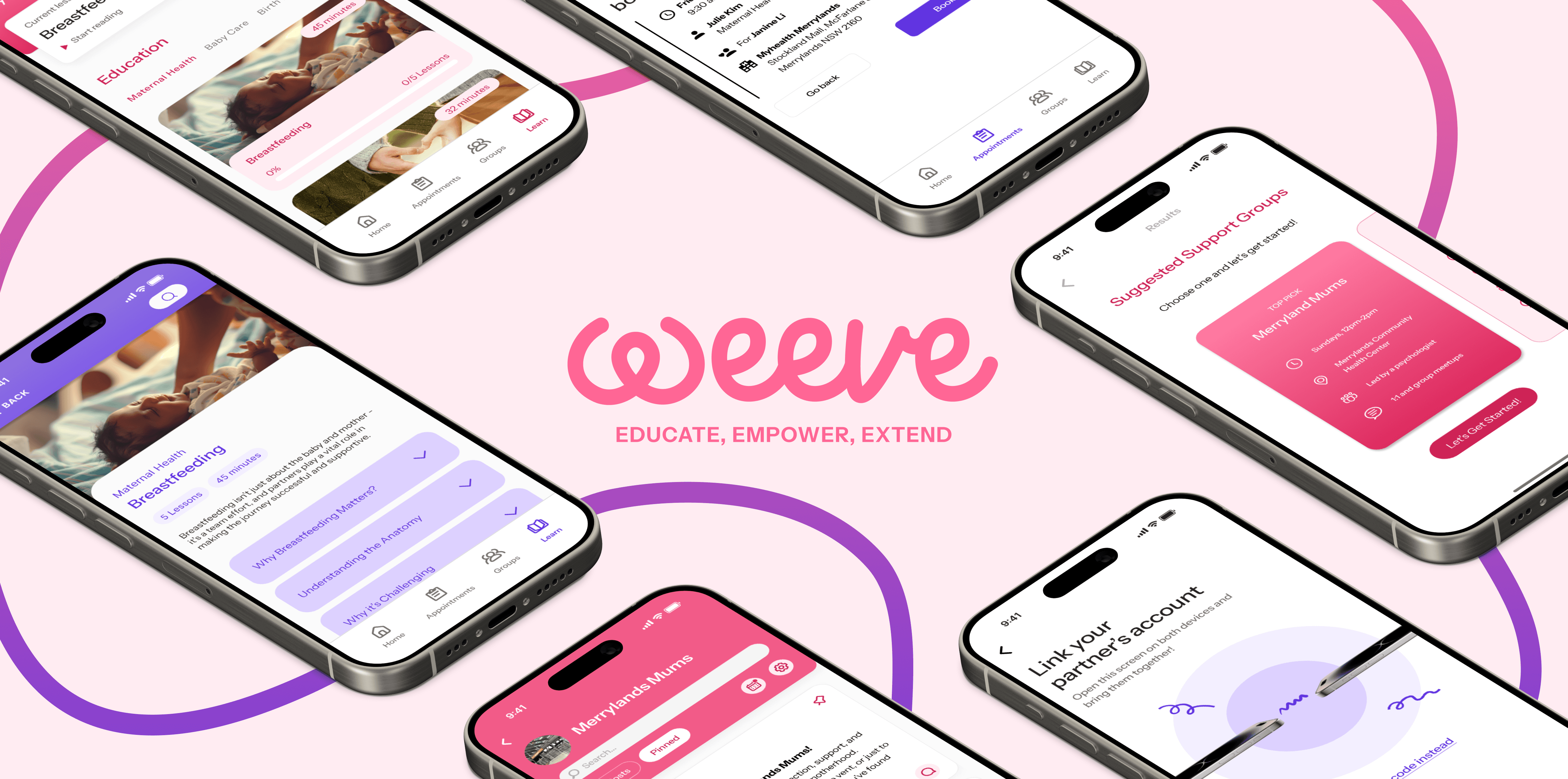
BRANDING + DESIGN SYSTEM
EDUCATE
EMPOWER
EXTEND


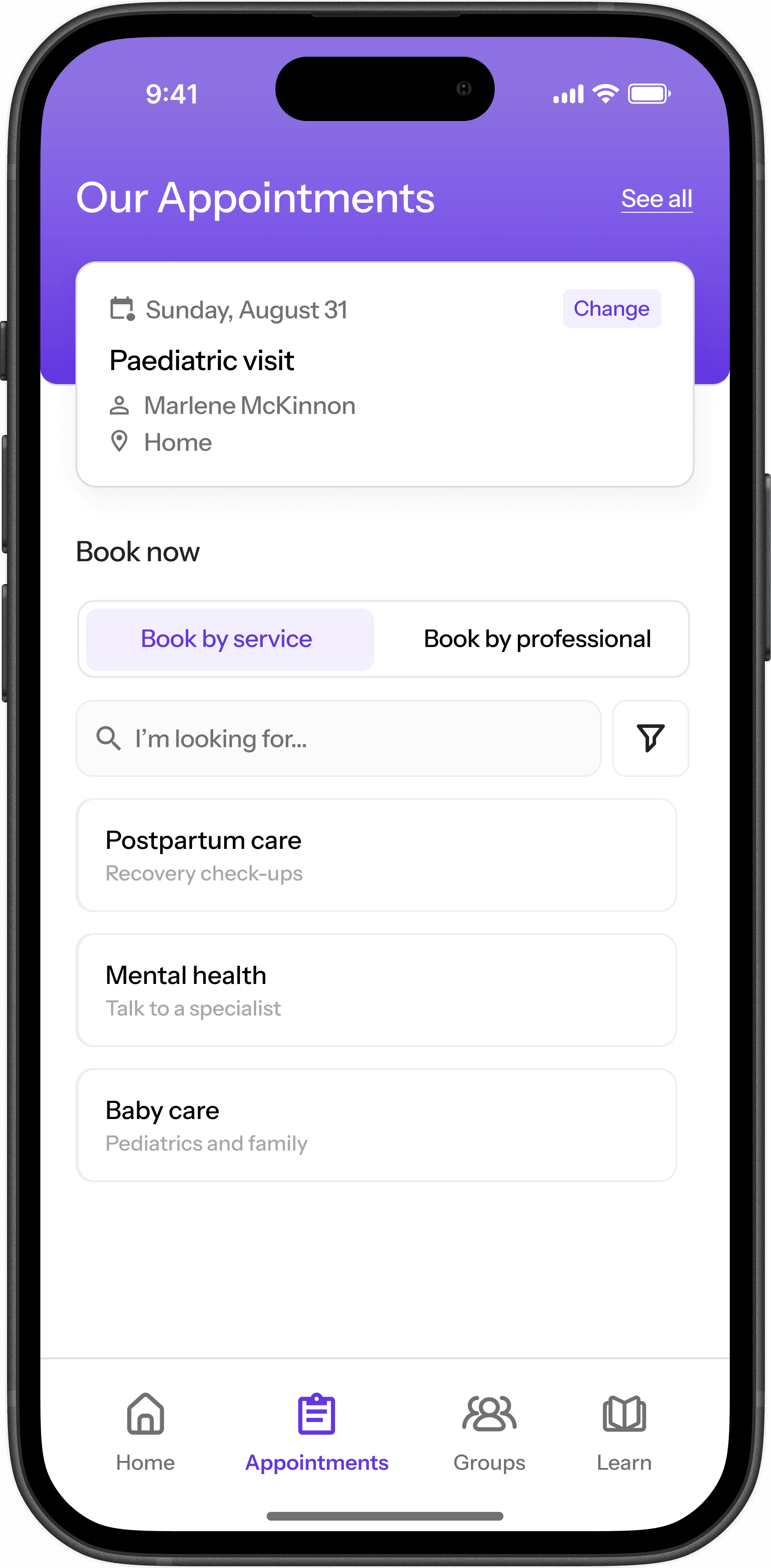
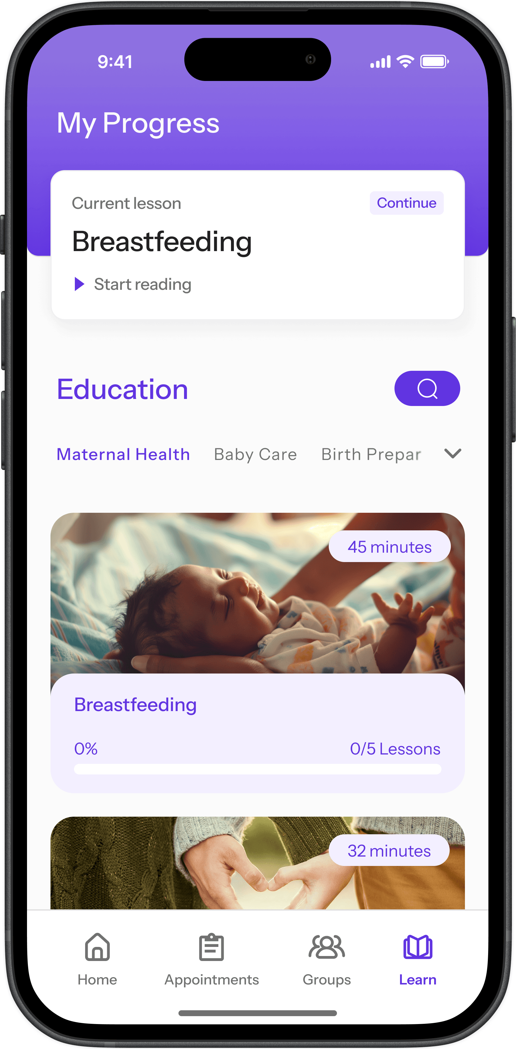
CORE FEATURES

HOVER FOR DEMO

HOVER FOR DEMO
HOVER FOR DEMO
HOVER FOR DEMO

HOVER FOR DEMO
DEMO VIDEO
WHATS NEXT?
"The Fourth Trimester"
With WEEVE, we could propose an initiative "The Fourth Trimester", or integrate with existing initiatives, to improve postpartum care with maternal health research units in local hospitals. Out app could be trialed as a hand-off once mothers are discharged from hospitals.
Referral Partnerships
Build referral partnerships with other related services like the Perinatal Anxiety & Depression Australia helpline to further extend the reach of mothers with maternal support. These services and organisations can also provide connections with healthcare professionals, providing better options when booking appointments.
Product for Carers
Alongside WEEVE, there is an opportunity to create tools as extensions for the app to be utilised by midwives and maternal health service providers. These tools can target meetup coordination and experience feedback, and give insight into midwife burnout and satisfaction to mutually improve outcomes for both mothers and carers.
LIMITATIONS + LESSONS
REFERENCES
Thank you for taking the time to read through this case study!